REBRANDING Clear
Clear Corretora is a brand of XP Inc. built for traders across all levels, combining performance-driven tools with a straightforward, no-noise approach to investing.
As part of the evolution of its visual language, I was one of the creatives responsible for leading the process in close collaboration with Tátil Design, helping translate strategic intent into a cohesive and scalable system.
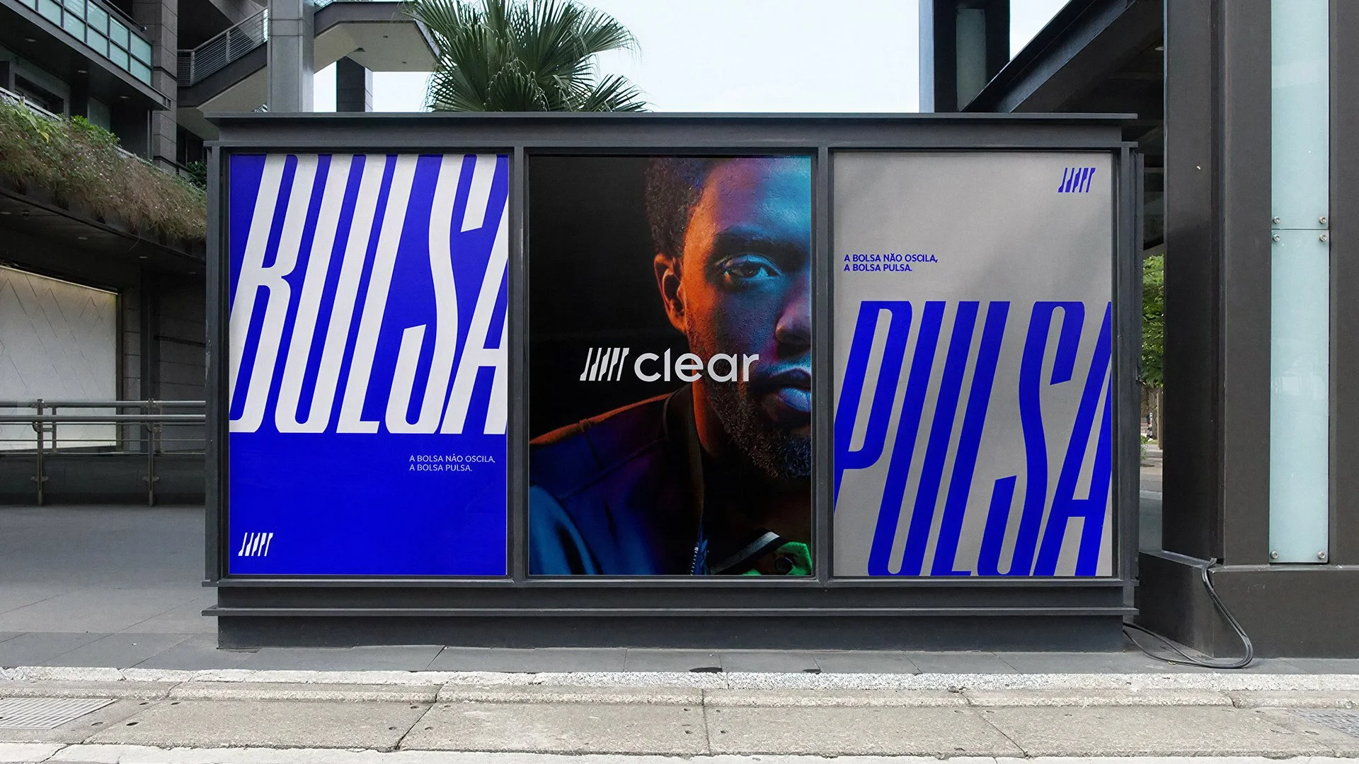
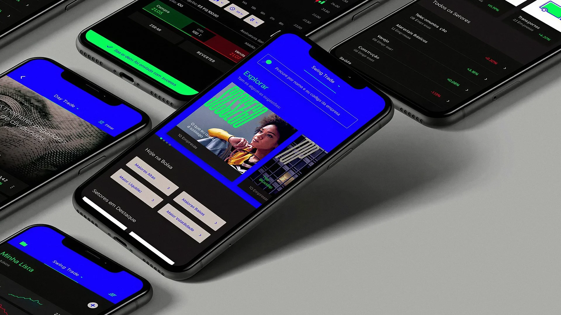
The challenge was to evolve Clear’s identity into something more modern, distinctive, and engaging, reinforcing its position as a key reference in Brazil’s variable income market. We developed a visual language designed to spark the investor’s exploratory mindset, embracing the adrenaline inherent to trading while simultaneously encouraging a more conscious and responsible relationship with personal finances.

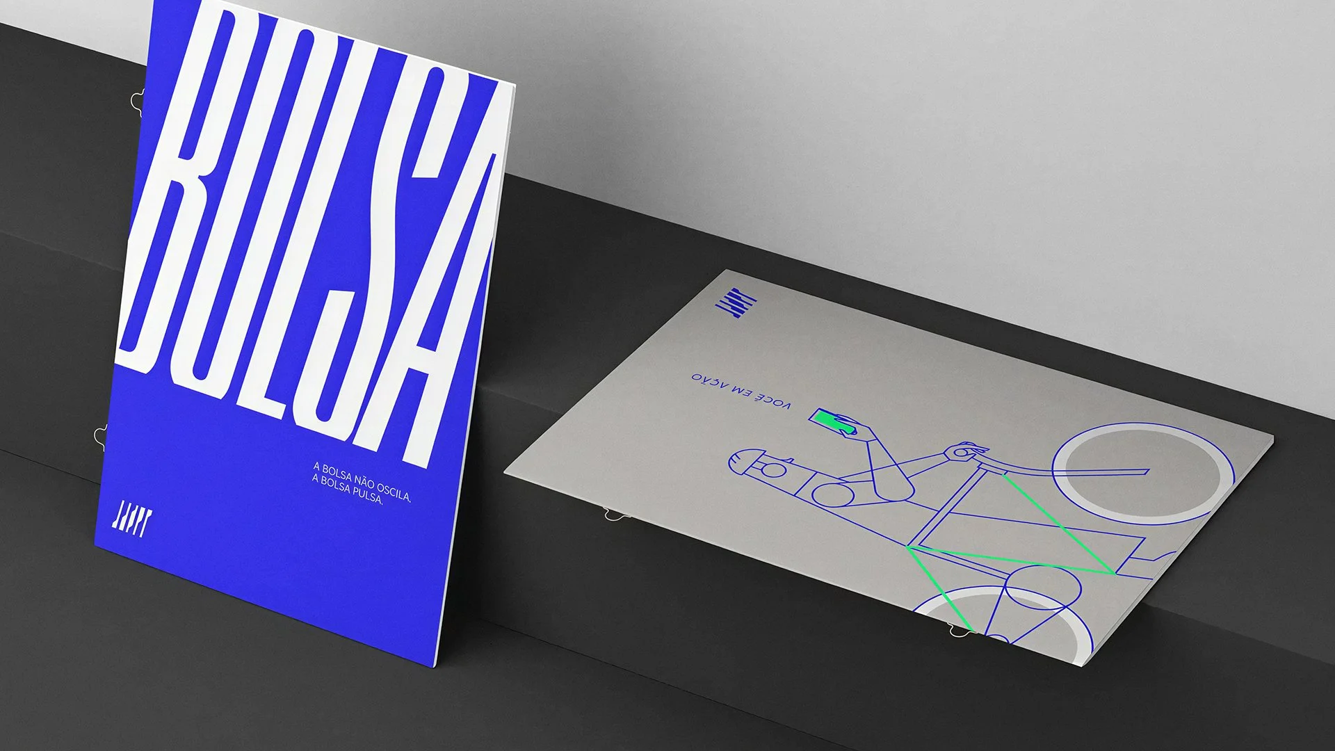
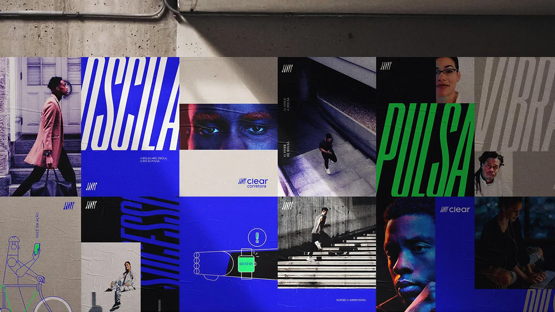
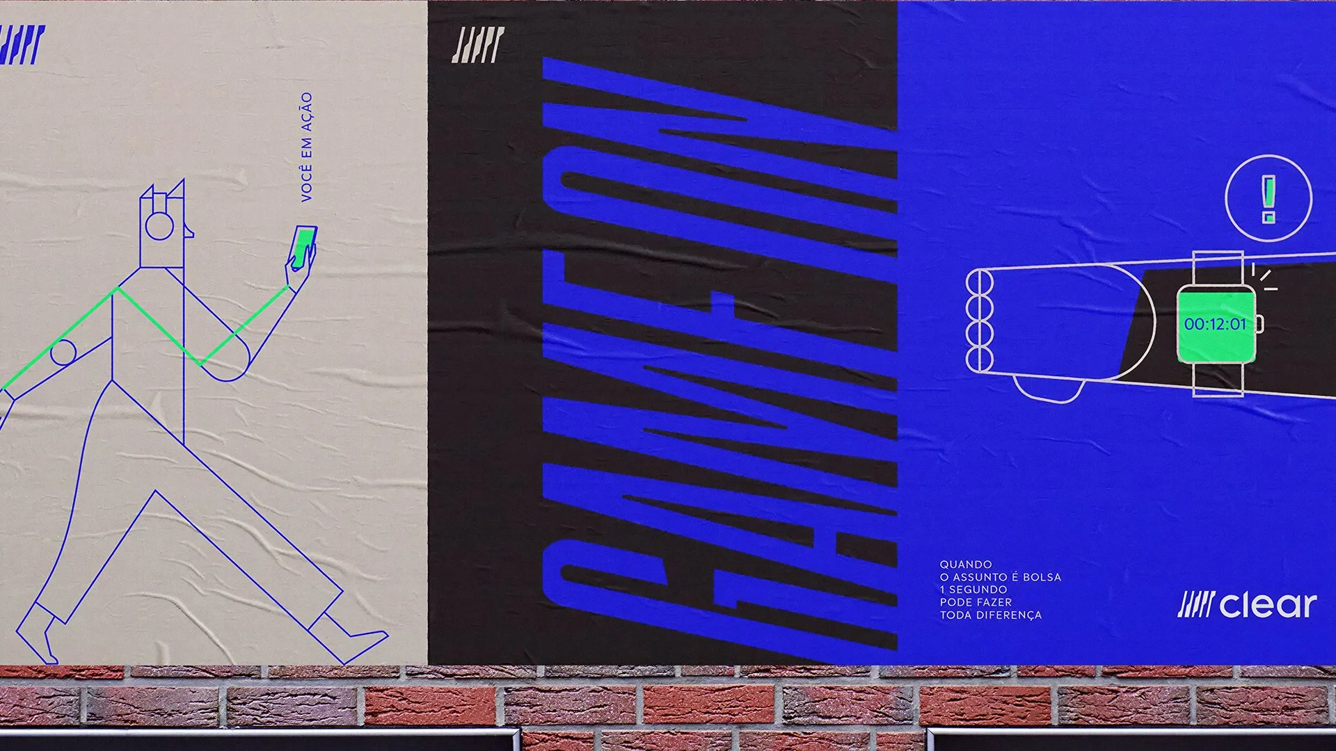
To further amplify the brand’s communication, we developed a series of illustrations in collaboration with Studio CAXA, designed to expand and complement the visual identity system.
The goal was to reinforce a communication style that is both clear and strategic, staying true to the essence already embedded in the brand’s name. The illustration set follows a consistent, pre-defined visual language, built on minimalist strokes and a modular approach. Each piece captures elements of the trader’s daily routine and the core tools of the financial market, translating complex behaviors and concepts into a simple, accessible, and visually cohesive system.